
Combat Shopping Cart Abandonment
Company: Promofarma· Role: UX Designer · Date: 2017
- B2C
- Marketplace
- UX
- Web app
- Mobile app - iOS & Android
ROLE
UX Designer.
TEAM
Partnered with the Product Owner and the Marketing Team.
TIMEFRAME
2016 - 2017
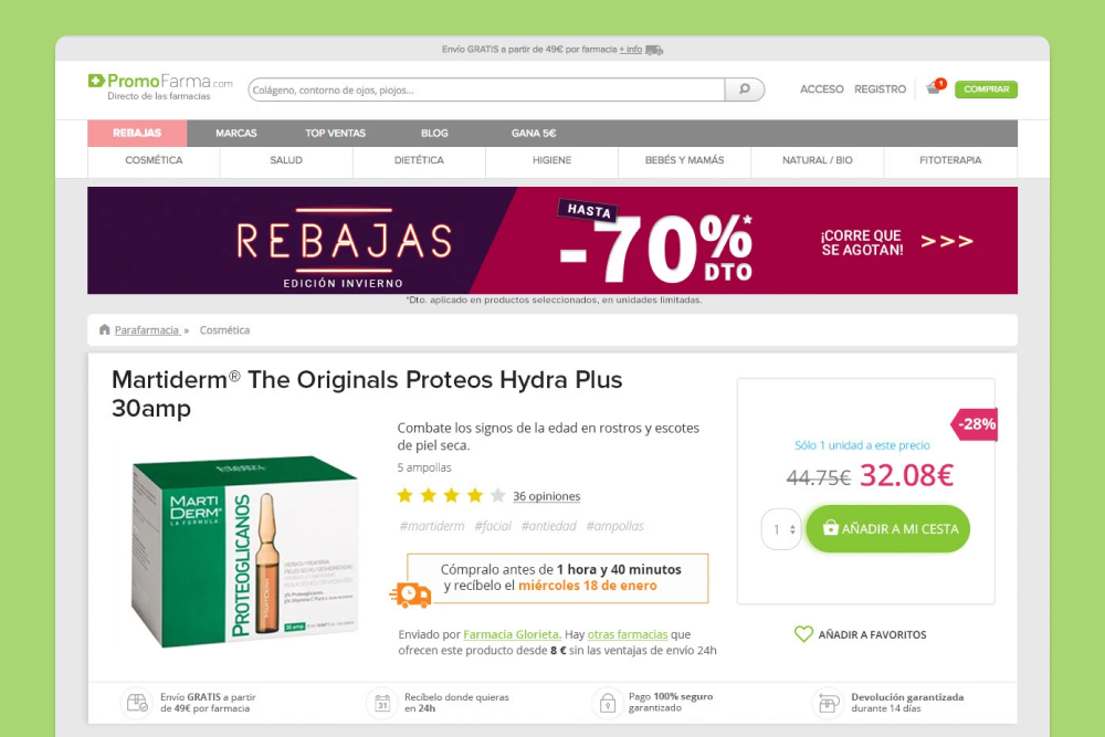
PromoFarma is an e-commerce marketplace that connects consumers directly with pharmacies and providers of health, beauty, and personal care products.

The Challenge
There was a high rate of cart abandonment in the Checkout flow.
Users frequently complained in the call center that they receive their orders fragmented over several days, different packages, and did not understand why they should pay additional shipping costs. Some users left negative reviews on the page for this issue.
The Role
From 2016 to 2017 I was the UX Designer at Promofarma. I worked closely with product owners, and developers under a Scrum methodology to create an end-to-end experience for the 24-hour delivery flow of Promofarma's marketplace.
I redesigned the payment flows, product details, and registration for the web and mobile apps (iOS and Android).
I improved the search process for the mobile apps, created the categories page, and designed the flow for adding products to the favorites list.
This effort led the company to win the following awards:
🏆 Best Mobile e-Commerce Strategy 2017 - E-COMMERCE AWARDS 2017
🏆 Best Digital Company Spain 2017 - E-COMMERCE AWARDS 2017
The Analysis
Promofarma was a marketplace, but analyzing user complaints and behaviors, I found that this term was very new to users (in 2017). Some users were used to buying online, but not in a marketplace. I assumed that this is why they didn't understand that shipments could arrive in different packages and on different days. Packages were frequently shipped from different pharmacies.
It was urgent to inform the user about what a marketplace is and how it works.
Users had to identify how many shipments they would receive when they make a purchase, when, and how much were the shipping costs.
The Solution
Informative reinforcement
Promofarma produced videos to describe how to buy at Promofarma. It was a collaboration between me, the UX team, and the Marketing team. These videos explained that Promofarma is a marketplace, where a user could find products offered by many pharmacies and, they could be easily purchased from the same site.
The videos were published on the home page, in the help section on the web and the mobile app, and also, on social networks.
I collaborated with the storytelling and the prototype that appears in the video.
Call Center agents also reinforced this message, explaining it to all users who contacted them.
(The video is on their Youtube channel: How to buy at Promofarma?)
The Checkout
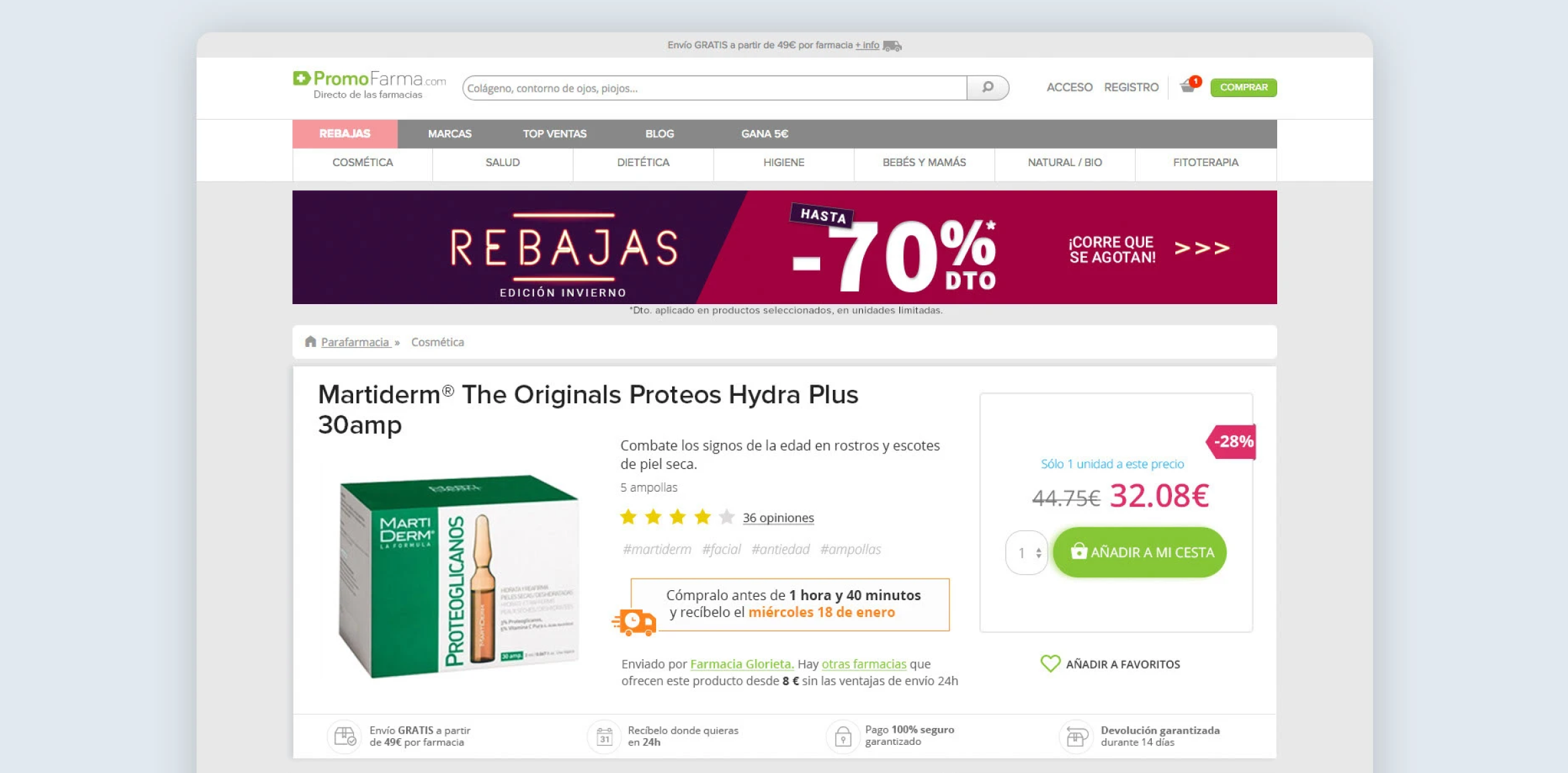
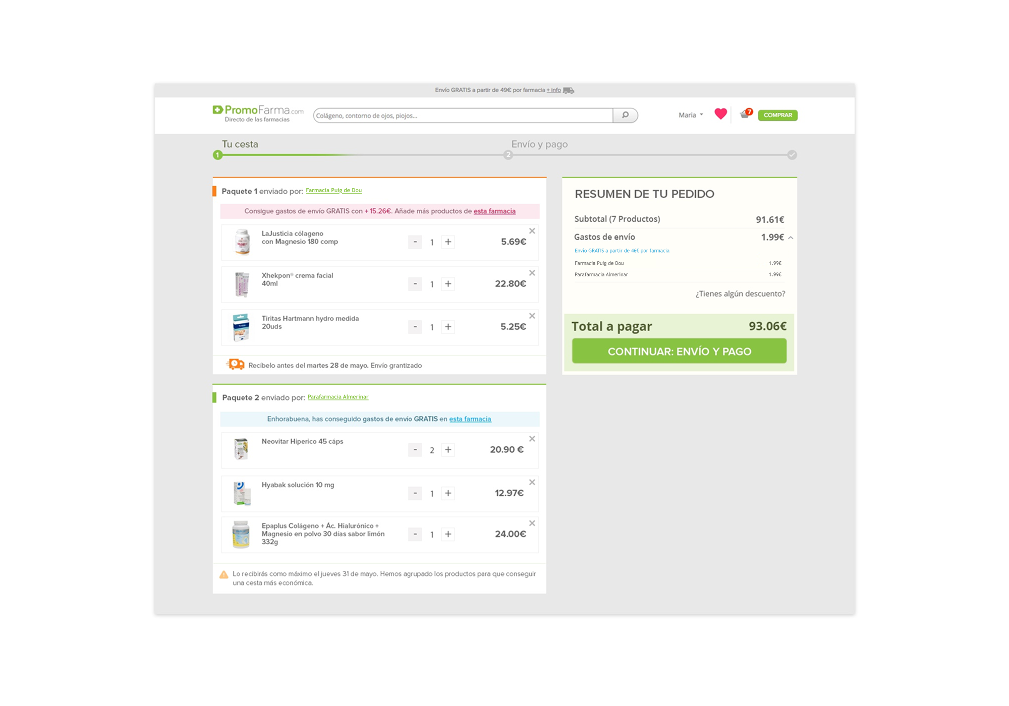
I redesigned the payment section: the number of packages, date of receipt, and shipping costs were more evident than before.
Also, I added a feature to help users get free shipping.
The orders of each pharmacy were visually differentiated. Separate blocks were shown for each pharmacy. Each block represented a package. In this way, the user could see at a glance how many packages he received.
Shipping costs were free from the €49 that the user spent in each pharmacy. When €49 had been spent at a pharmacy, a blue informative message appeared. The blue color was also used in the total sum to identify the free shipping costs.
As long as €49 per pharmacy was not exceeded, the informative message was pink. The message told how much money was needed to get free shipping. This article included a link to this pharmacy where the user could continue shopping if they wanted to get free shipping costs.
Depending on the pharmacies, there were packages with regular delivery and others with 24-hour special delivery. 24-hour delivery packages had an orange border and a truck icon. At the end of each pharmacy box, there was a block of information about the shipping dates.
This idea was tested first by A/B testing and was soon incorporated into the entire web.
With this solution, the cart abandonment rate was reduced by 25%, complaints in the call center and social networks decreased, and purchases increased by 15%.
Wireframe

Final mockup
Impact
🛒 25% reduction
in cart abandonment rate.
😊 50% fewer
call center complaints.
💶 15% increase
in sales
Selected work
Burst. AI Prompting TechniquesAI Prototyping - Productivity

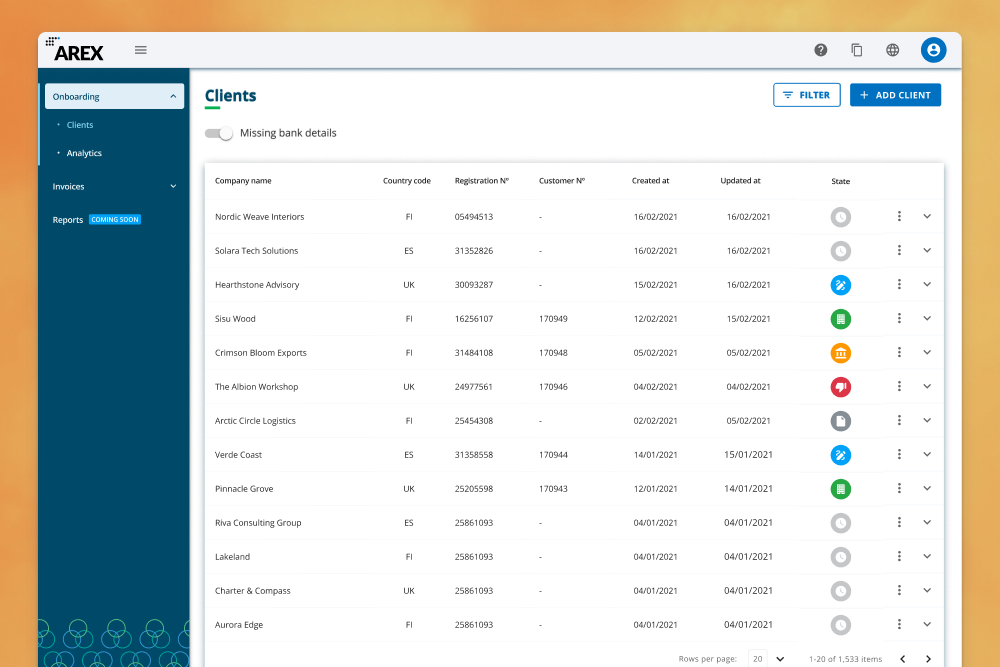
Fintech Back Office: Payment ReconciliationFintech - SaaS - B2B

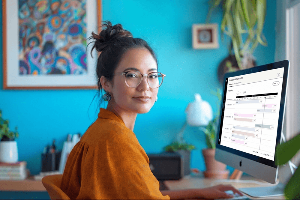
Data Visualization for Faster DecisionsSales - SaaS - B2B
A Door-to-Door Journey Pilot for Renfe MaaS - SaaS - B2B - Mobile
Partner Portal & Pigment: Platform + Design SystemFintech - SaaS - B2B
Unlocking Real-Time Team PerformanceSales - SaaS - B2B
Combat Shopping Cart Abandonment - Promofarma Marketplace - E-Commerce - B2C
Boosting user engagement - Promofarma Marketplace - E-Commerce - Mobile