
Partner Portal & Pigment (DS)
Company: AREX Markets · Role: Lead Product Designer · Date: 2021
ROLE
Lead Product Designer.
TEAM
Cross-functional partnership between 1 PM, 1 Front-End Lead. Partnered with the Head of Product and Head of Marketing on the branding effort.
TIMEFRAME
2021. (2 Quarters. 1 for the MVP, 1 for subsequent main iterations.)
Problem Statement
As the fintech startup AREX prepared to expand its SME invoice financing platform into the UK and Spain, its primary tool for accounting partners became a critical business risk. The Partner Portal was outdated, uncompetitive, and difficult to use, blocking this essential growth.
My mission was twofold: to redesign the portal for a top-tier user experience and to use this project to build the company’s foundational Design System.
The Challenge
How might we redesign the portal experience so that our busy partners can manage their client leads efficiently and with total confidence?
From friction to flow
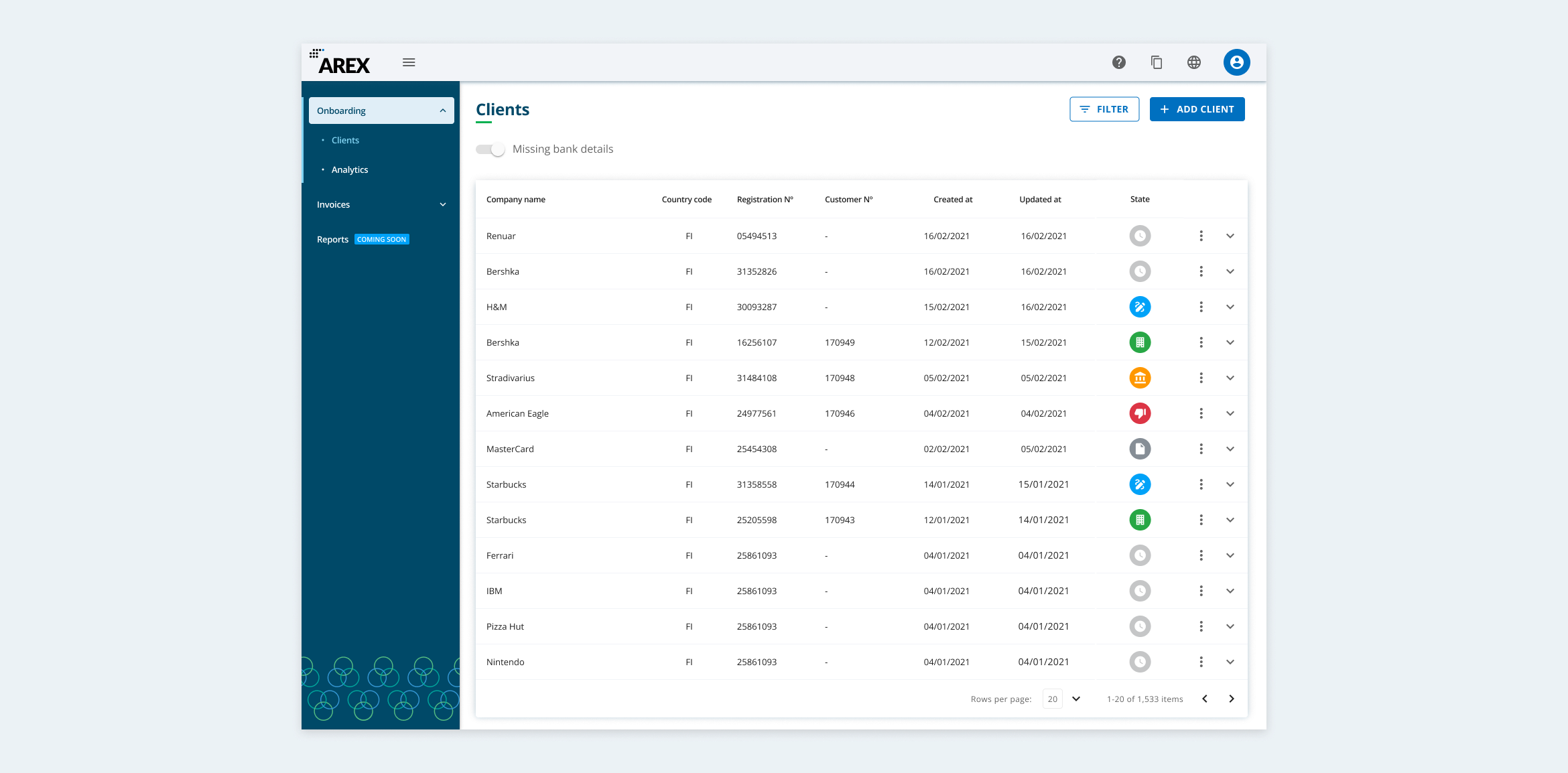
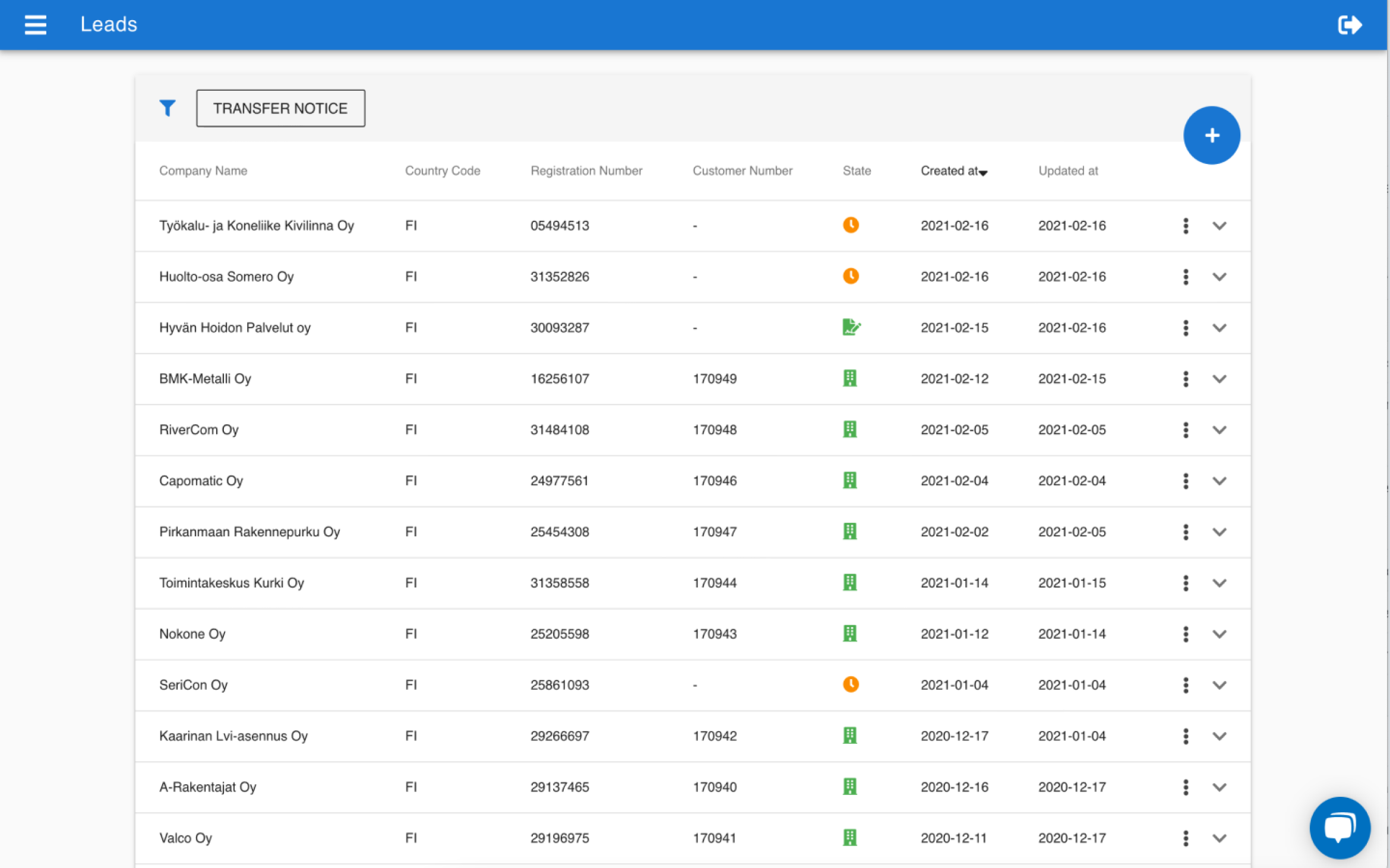
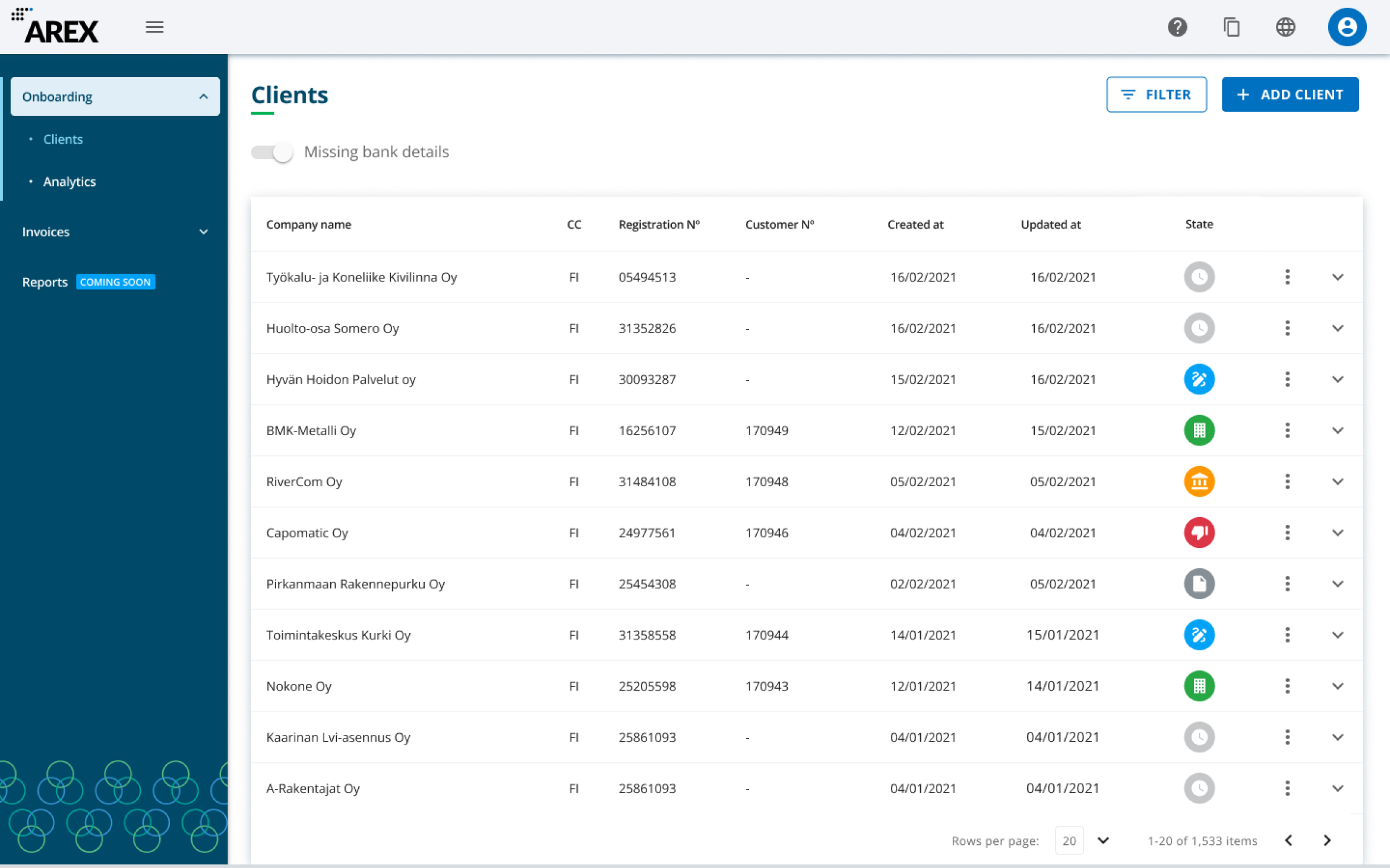
I designed the full modernization of the Partner Portal, moving the outdated, unbranded, high-friction tool to an intuitive, research-driven platform. This shift eliminated user frustrations and established a seamless workflow capable of supporting company-wide strategic expansion.
Before and after
Understanding Non-Technical Users
Our partners weren't tech-savvy. They were busy business people who needed to get information quickly without friction.
I used several methods to identify the user's frustrations: user personas, interviews, and heuristic analysis.
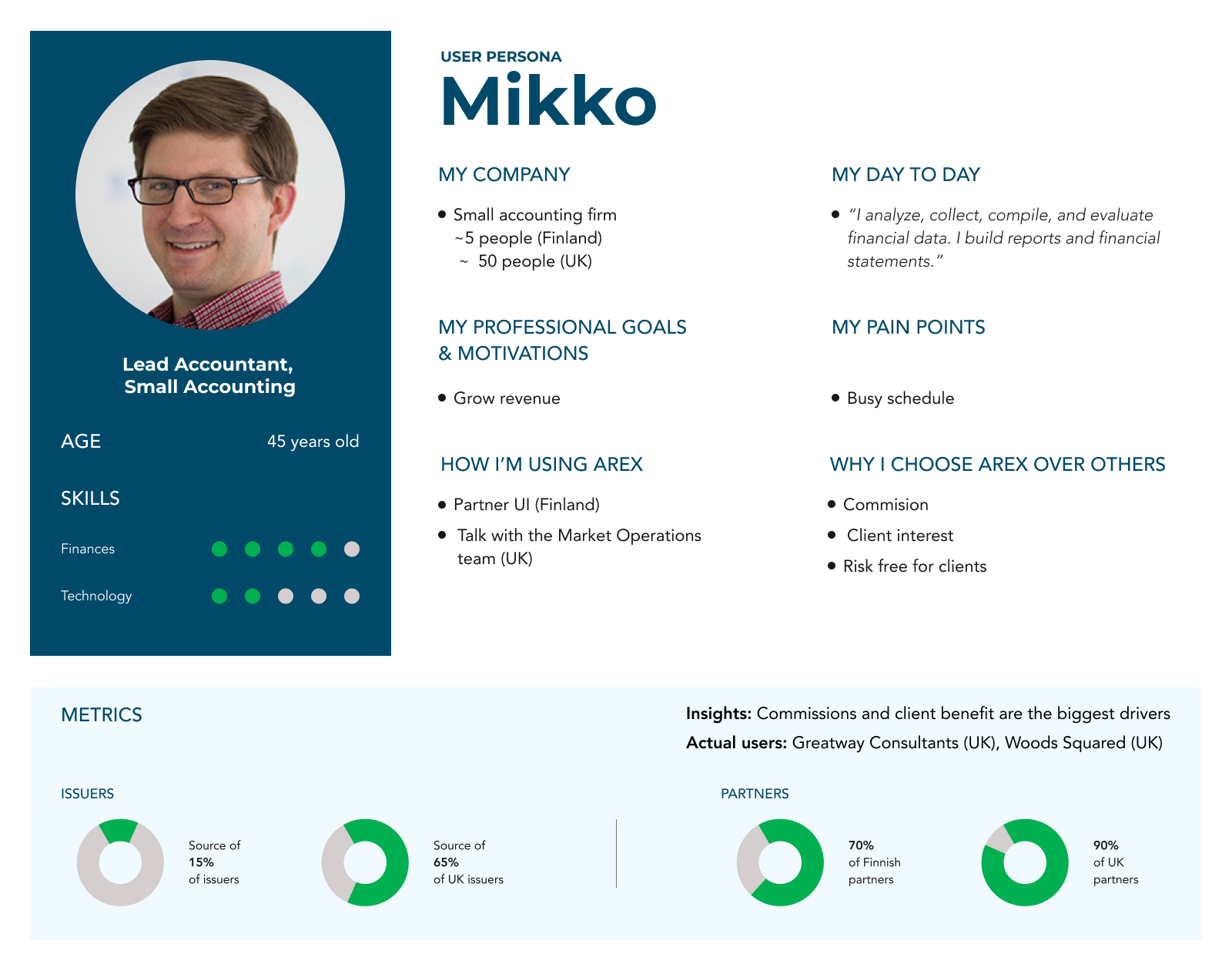
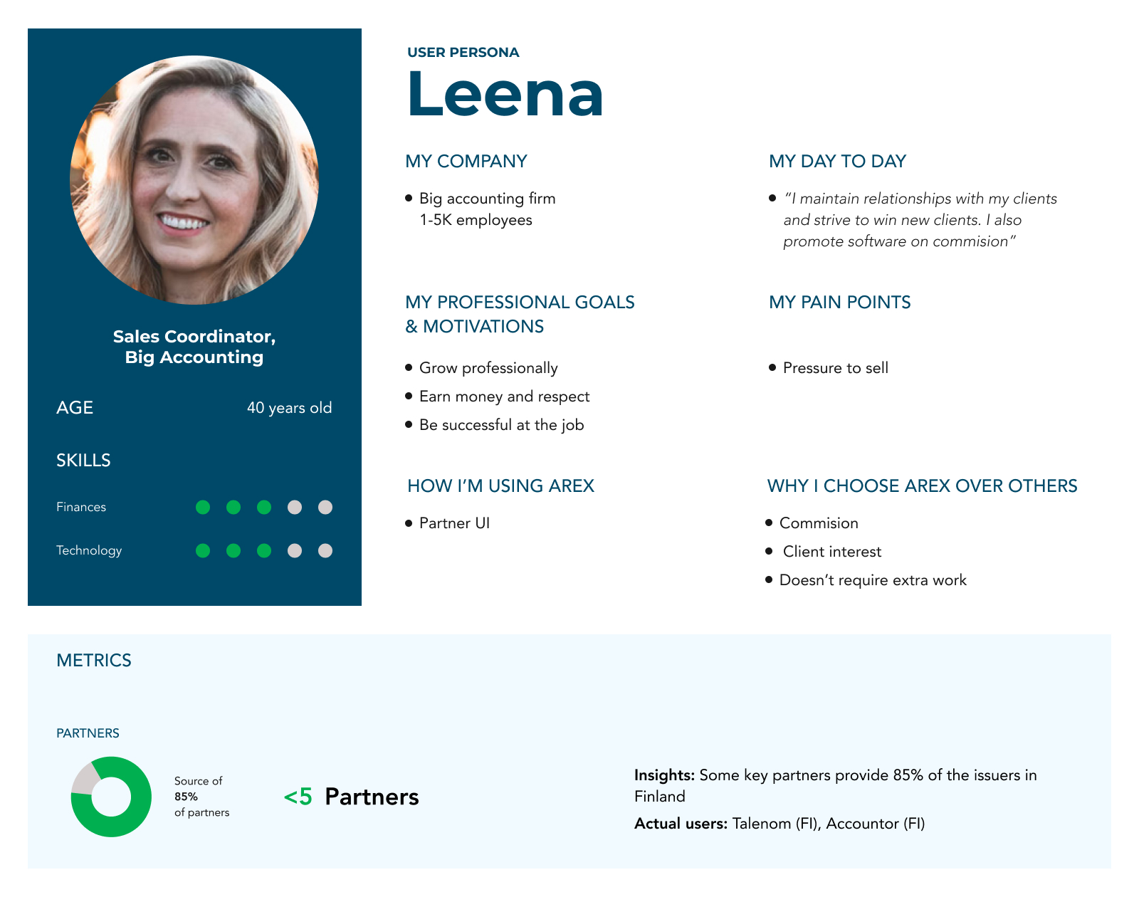
User Personas: based on internal data and sales and operations calls, I defined two Personas: "Mikko," and "Leena". The first one was a partner with limited tech skills who constantly relied on our Operations team, and "Leena," an efficient partner who appreciated that the tool didn't create extra work for her.
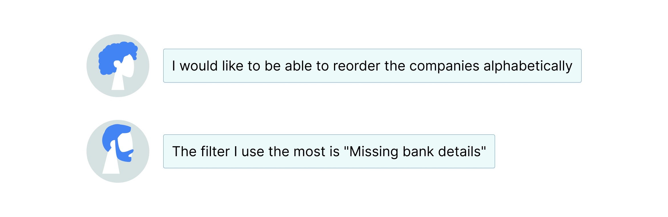
I conducted a series of interviews with our partners that uncovered specific pain points:
Heuristic Analysis: My evaluation of the old interface revealed critical usability issues. Forms created user frustration by not indicating which fields were required, while ambiguous status icons, which only differed by color, were difficult for users to recognize and remember.

Based on these priorities, every design decision I made was a direct response to a detected problem.
| ☹️ User Insight (The Problem) | 🚀 My Design Solution |
|---|---|
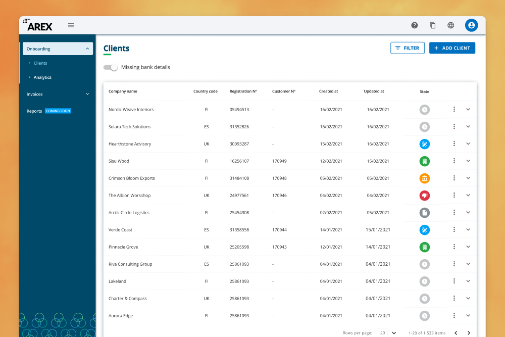
| ⚠️ They needed to find leads with pending bank details fast. | ✅ I made the "Missing bank details" a persistent quick filter. Other filters were grouped into a clean modal. |
| ⚠️ They wasted time searching for companies due to a lack of sorting. | ✅ I enabled sorting on every column of the table, giving users full flexibility to manage their data. |
| ⚠️ The status icons were confusing and ambiguous. | ✅ I redesigned the statuses with unique, recognizable icons, using semantic colors and tooltips to reinforce their meaning. |
| ⚠️ The forms generated errors and frustration. | ✅ I proactively marked all mandatory fields, preventing users from having to guess what was required. |
From Insights to Solutions
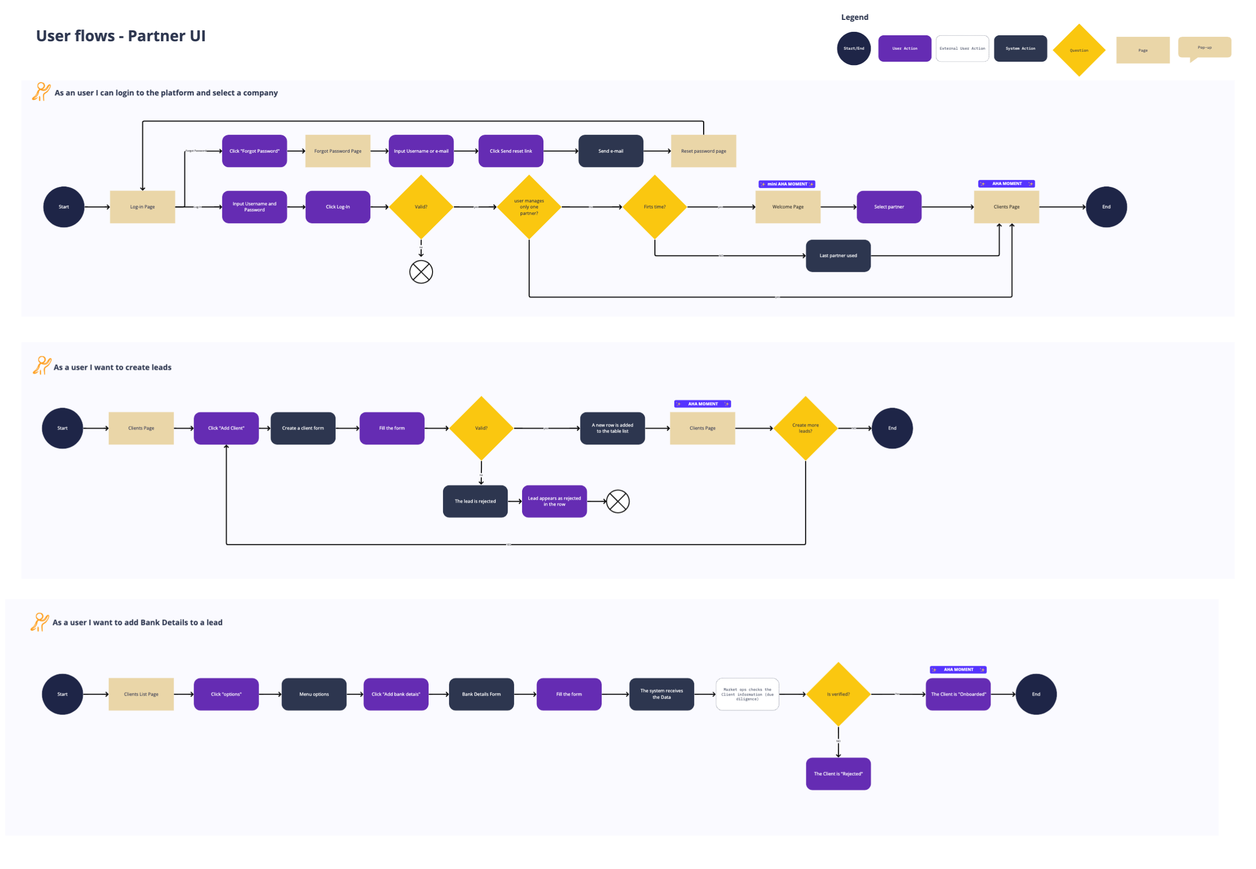
I collaborated with the Product Manager to define the fundamental user stories for the MVP:
1
Creating a new lead
As a partner, I want to create a new lead in the system so I can manage and track its progress in an organized manner.
2
Completing a lead
As a partner, I want to update the information of an existing lead so I have all the necessary details to complete the data.
3
Finding a company
As a partner, I want to search and filter companies in the system so I can quickly find what I need based on specific criteria.

Building the Design System
This project was the perfect opportunity to scale design at AREX. I spearheaded the creation of PIGMENT, the Design System.
Foundations: I defined design tokens (colors, typography, spacing) using Token Studio to ensure a single source of truth between Figma and code.
Technical Synergy: Together with the Front-End Lead, we adopted Vue.js + Quasar (Material-based). This allowed us to build a robust component library that balanced speed with customization.
Living Documentation: While the original Storybook is no longer public, I have recreated a selection of the core components in an interactive demo to showcase the system's behavior and architecture.


Testing Assumptions with Real Users
A design isn't complete until it's tested. I built a high-fidelity prototype in Figma and designed the test scenarios for usability sessions. In partnership with the PM, we validated the design with 5 partners from Finland and the UK.
The test confirmed the main flows were intuitive, but it also allowed me to uncover a new, critical insight: Users needed to know the reason for rejection to take action. I immediately iterated on the design to include this feedback, turning a moment of frustration into an opportunity.


Filters.
The new Partner Portal was successfully launched. 🤗 Video below.
Impact
⚡️ Increased User Efficiency
I reduced the time to create a new lead to just 33-46 seconds. This allowed partners to manage more clients in less time.
🚀 Unlocked Growth
The new portal was a key enabler for AREX's successful launch in the UK and Spain, helping the company achieve its growth targets
🧩 Multiplied Team Agility
The "Pigment" Design System became the single source of truth. The team could now build new features faster and consistently.
Iterations
Post-launch, I continued to monitor user behavior to identify further improvements.
- I noticed the system took a moment to refresh a lead's status after an update, causing confusion. I added a loading state to provide immediate feedback.
- I observed users scrolling through the entire country list in the phone prefix dropdown. I redesigned the component to feature the most frequent countries (Finland, UK, Spain) at the top.
Reflections on my journey
✨ As the Founding Designer, I felt a responsibility to solve our inconsistencies at their core. Because of this, I championed the idea of creating a Design System, presented its benefits to leadership (the CTO and Head of Product), and secured their buy-in to begin with 'Pigment.' It was proof that a single product's problem can be the gateway to a company-wide solution.
Selected work
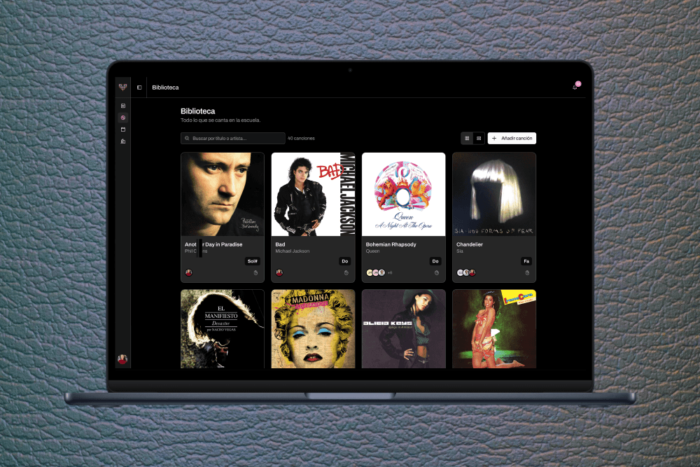
VocalKey, vocal range managementAI Product Design

Unlocking Real-Time Team PerformanceSales - SaaS - B2B
Burst. AI Prompting TechniquesAI Product Design

Fintech Back Office: Payment ReconciliationFintech - SaaS - B2B

Data Visualization for Faster DecisionsSales - SaaS - B2B
Partner Portal & Design SystemFintech - SaaS - B2B
A Door-to-Door Journey Pilot for Renfe MaaS - SaaS - B2B - B2B2C - Mobile

María Rey. Based in Barcelona & working remotely too.