
Fintech Back Office: Payment Reconciliation
Company: AREX Markets · Role: Lead Product Designer · Date: 2021-2023

ROLE
Lead Product Designer.
TEAM
Cross-functional capacity across all areas (Payments, Investors, Clients, and Platforms), partnering with PMs on strategy and with Tech Leads and FE Developers on execution.
TIMEFRAME
2021 - 2023
The Problem
AREX (est. 2014) was a B2B Fintech with an invoice marketplace: it purchased invoices from SMEs needing immediate liquidity and converted them into a negotiable asset called an ETR (Electronic Trade Receivable), which investors acquired through automated trading robots
The company operated in the Nordic market and was expanding into the UK and Spain, which meant a growing volume of invoices and payments to reconcile daily. The Operations team managed this process manually, working against tight banking cut-off times, and on some days, the work spilled over to the following day. Beyond the time pressure, there was a real human risk: the fear of making errors in a critical financial operation, and the dread the rest of the team felt whenever someone who owned this process was absent.
The Backoffice had grown organically for years without any design direction, directly impacting the team's efficiency. The most critical flow was Matching: when money arrived to pay the invoices, those payments entered AREX's account as incoming payments, and the Operations team had to reconcile each one with the corresponding invoices.
The main problems were:
- Chaotic navigation: An information architecture with no logical hierarchy and inefficient workflows.
- Technical and visual debt: A mix of frameworks and duplicate components that created inconsistency and made maintenance costly.
- High cognitive load and fragmented experience: Key tasks required users to navigate through inconsistent layouts and interaction patterns. This lack of a cohesive design language resulted in an unpredictable and frustrating learning curve for the team.
The Challenge
1. Redesign the Information Architecture for intuitive navigation.
2. Build a foundational UI Kit (Design System seed) to ensure visual consistency.
3. Optimize key workflows to increase the team's productivity.
This case study will focus on the third objective: the Matching module.
Why Matching?
In conversations with the four area PMs, the Payments PM flagged that Operations was taking too long to complete the matching. With the expansion already underway, that bottleneck was going to grow proportionally: more markets, more volume, more pressure on a flow that was core to the business. There were information architecture and usability problems across other areas of the Backoffice, but none with that level of direct impact on the daily financial operation. That's why this case study focuses on the third objective: the Matching module.
Workshops: giving users a voice.
I organised a series of online workshops where I brought together key users from the Operations team and the Payments PM to map their workflows. Beyond identifying problems, we achieved something more important: building a shared language and aligning everyone around the same priorities.
This new alliance became the foundation of our process. Through prototype testing sessions, users saw their feedback translated into real changes, which not only validated design decisions but built the trust needed to truly transform the tool.

Key insights: the 3 pain points of Machting.
🚩 No visibility into payment status.
When selecting invoices for matching, there was no indicator showing whether the selected sum covered the incoming payment amount, whether there was a remaining balance, or whether it had been exceeded. The team relied on manual calculations, error-prone in a context where precision is critical.
🚩 Communication lived outside the tool.
When someone needed to leave a note about a payment (a discrepancy, a question, an instruction) they sent it via Slack. Those notes were then manually copied into an Excel sheet. This broken flow across three separate tools caused copy-paste errors, loss of context, and constant friction that interrupted the team's focus.
🚩 Navigation with no way back.
Moving from Incoming Payments to the settlement screen opened a new page with no connection to the previous flow. There were no breadcrumbs and no way to go back. Every transition was a dead end.
A Holistic Solution for a Focused Team
Full automation of the matching process was not a viable option at the time: the backend data structure required significant engineering work before automation could be considered. The challenge was to design a guided flow that reduced cognitive load and the risk of errors, without depending on a technical solution that wasn't ready yet.
From the workshop insights, the solution was structured around three main design decisions:
1. Incoming Payments: Status Clarity and In-Context Communication.
The entry point of the flow is the Incoming Payments screen, where the Operations team views all incoming payments. This screen concentrated several of the problems identified in the workshops and was redesigned on three fronts.
Status per payment: Each incoming payment now displays its status explicitly: Unmatched, Partial, or Resolved. At a glance, the operator can see which payments are pending reconciliation, which are partially resolved, and which are closed, without opening them one by one.
Status filters. I added filters to narrow the table by status, especially useful in high-volume contexts where the team needs to quickly prioritise payments requiring attention.

A collaborative workspace. To eliminate the dependency on Slack and Excel, I designed a contextual comments panel anchored to each individual payment. Every note is recorded with authorship and timestamp directly inside the Backoffice, turning a scattered conversation into a permanent audit trail linked to the relevant payment.

2. Matching Screen: A Guided Two-Step Flow.
Once the operator selects an incoming payment, they access the Matching screen, where they reconcile that payment with the corresponding invoices. To structure this process, I designed a two-step flow.
Step 1. Invoice selection :
The system automatically proposes invoices it considers relevant to reconcile with the selected payment. Although full automatic matching is not available, these proposals serve as a starting point for the operator to review and validate.
If no proposal fits, the operator can use the integrated search to find invoices by number, reference, or remitter. Both proposed and searched invoices are selectable, and the selection is unified.
As the operator selects invoices, the Settlement Balance panel reflects the status in real time through colour and a progress bar:
- ⚪️ Grey. No invoices selected yet.
- 🟠 Amber. The sum partially covers the payment.
- 🟢 Green. The sum matches the payment exactly.
- 🔴 Red. The sum exceeds the payment amount.


Step 2. Review and approval :
The operator reviews the selected invoices before confirming. They can go back to the previous step and adjust the selection. If everything is correct, they approve the settlement; the payment is settled and itsstatus in the Incoming Payments table automatically changes to Resolved.

3. Connected Navigation with Breadcrumbs.
I redesigned the navigation structure so that the Matching flow and the settlement screen were connected within a single experience. Breadcrumbs in the topbar always provide location context and allow the user to go back at any point, eliminating the dead ends of the previous system.
Measuring the Impact
20% reduction in daily reconciliation time.
Transitioned from a chaotic table to a guided 2-step flow. I introduced status filters (Unmatched, Partial, Resolved) and provided immediate visual validation via a side panel that changes color when the balance is successfully matched.
How it was measured: Using the free version of Hotjar, I manually analyzed 20 session recordings before the redesign and 20 afterward, tracking the exact time it took operators to process a standard batch of payments and invoices.
Minimized context-switching.
Designed an integrated comments panel within each payment detail view. This centralized operations, keeping queries and incident traceability entirely within the back-office ecosystem.
How it was measured: Remote Shadowing: Through Hotjar recordings, I noticed users frequently going idle in the legacy system because they were leaving the app to ask questions on Slack or log data in Excel. After launching the comments panel, recordings confirmed that users were resolving incidents without ever losing the tool's context.
100% pattern consistency and technical adoption.
Designed and co-documented complex transactional patterns (such as the guided stepper and advanced filters) alongside the development team, ensuring they were optimized to handle high data density.
How it was measured: This was an objective metric of technical adoption. The engineering team reused 100% of the code from these components to build subsequent back-office modules which significantly accelerated delivery speed in the following sprints.
⏱️ -20%
Daily Reconciliation Time
🛠️ 100%
In-App Issue Resolution (0 External Tool Switches)
🧩 100%
Technical Pattern Adoption & Code Reuse
Reflections on my journey
Redesigning the Back Office was a marathon of continuous improvement, not a single sprint; this case was only one example. I was constantly shipping new features and enhancements in parallel. I drew several key learnings:
✨ Users are your greatest design partners. Their constant feedback became the compass for the project.
✨ Small iterations are essential for internal tools.
✨ Systematizing from day one is an accelerator. Investing in consistency and order from the start enabled faster, more coherent growth down the line.
Selected work
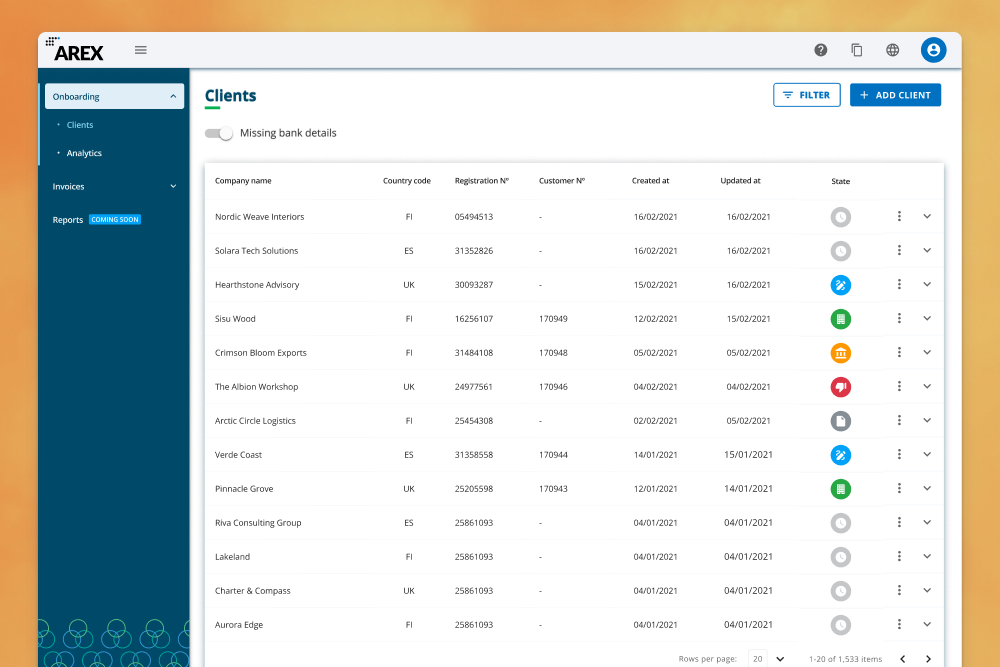
Partner Portal & Pigment: Platform + Design SystemFintech - SaaS - B2B

Unlocking Real-Time Team PerformanceSales - SaaS - B2B

Fintech Back Office: Payment ReconciliationFintech - SaaS - B2B
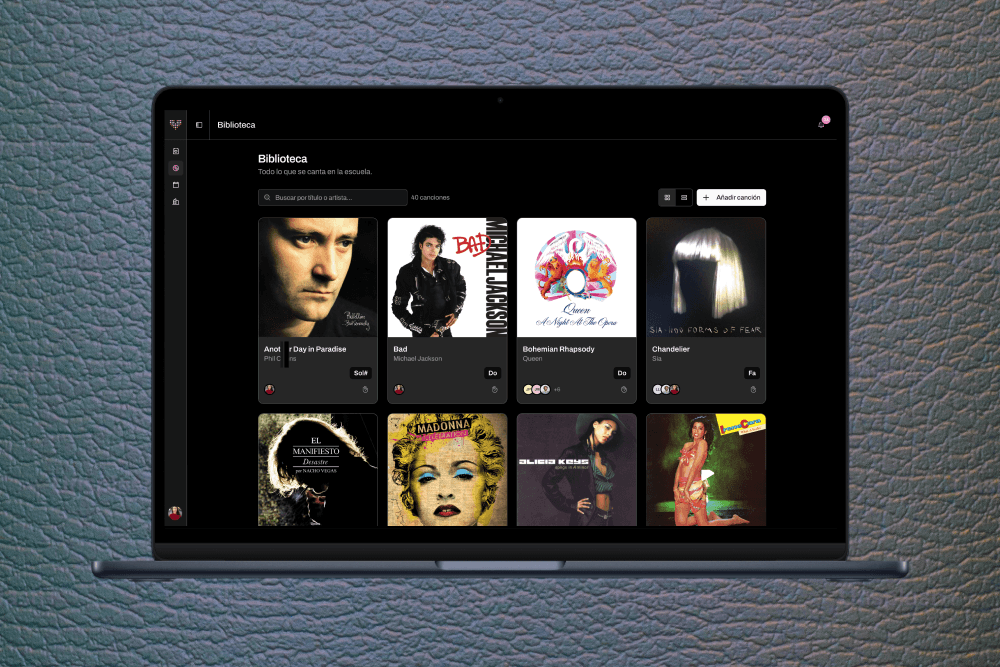
VocalKey, vocal range managementAI Product Design - Music - SaaS
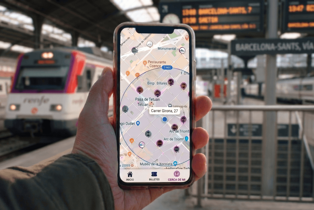
A Door-to-Door Journey Pilot for Renfe MaaS - SaaS - B2B - Mobile
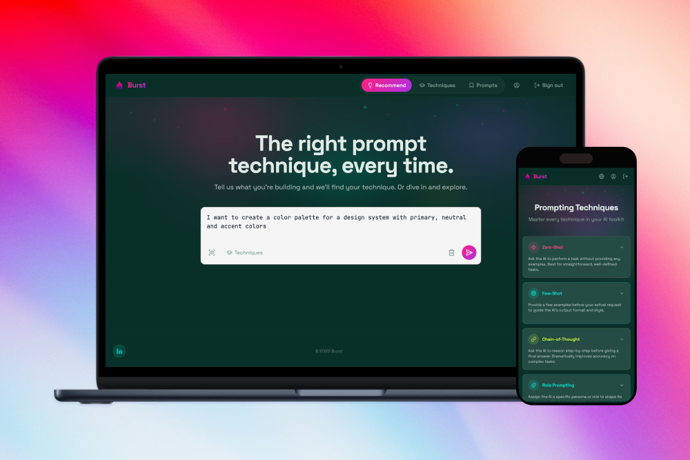
Burst. AI Prompting TechniquesAI Product Design - Productivity

María Rey. Based in Barcelona & working remotely too.